Facebook Event Photo Size: Create High-Impact Images for Maximum Engagement
A well-designed Facebook event photo is one of the most powerful tools for attracting attention to your event. With over a billion monthly users on Facebook, many of whom rely on the platform to discover local and online events, creating an eye-catching and correctly sized event cover can make all the difference in converting views to RSVPs. In this article, we’ll cover everything you need to know about Facebook event photo sizes, recommended dimensions, tips for creating high-quality images, and more.
Table of Contents
ToggleWhy Facebook Event Photo Size Matters
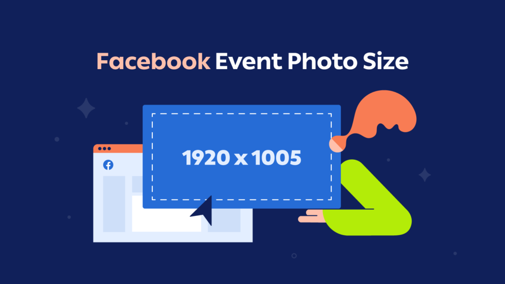
Facebook event photos are the first thing users see when they come across an event page. A properly sized, high-quality image does more than catch the eye – it conveys professionalism and draws people in. Using the recommended Facebook event photo size ensures that your image is displayed optimally on all devices, whether users are browsing on desktop or mobile. Incorrect dimensions can result in cropped, blurry, or pixelated images that don’t make a strong impression.
What Is the Best Size for Facebook Event Photos in 2024?
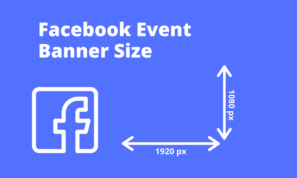
To ensure your event cover looks great across devices, the recommended Facebook event photo size for 2024 is 1200 x 628 pixels, with an aspect ratio of 1.91:1. This size works best for both desktop and mobile views, preventing issues like unwanted cropping and maintaining a high-resolution display.
Key Points for Optimal Facebook Event Photo Dimensions
- Dimensions: 1200 pixels wide by 628 pixels tall
- Aspect Ratio: 1.91:1
- File Format: Use JPEG or PNG for best quality
- Resolution: Aim for 1200 x 628 pixels to prevent pixelation
Designing for Mobile and Desktop Views
Facebook event covers are displayed differently on mobile and desktop, so it’s crucial to ensure your image works well on both. Here’s how to make sure your event cover remains visually appealing across platforms:
- Center Key Elements: Keep text and essential visuals in the center to avoid them being cut off on smaller screens.
- Use a Simple, Clear Design: Complex images may look great on desktop but can be hard to see on mobile. Stick with simple graphics, minimal text, and high-contrast colors.
- Preview on Both Platforms: Before you publish, preview your image on both desktop and mobile to ensure it looks sharp and displays all essential information correctly.
Tips for Creating a High-Quality Facebook Event Photo
A successful Facebook event photo requires more than correct dimensions; it also involves creating a compelling design that reflects the essence of your event. Here are some tips to enhance your event cover:
Use High-Resolution Images
Quality is everything. A high-resolution photo will look polished and professional, helping establish trust with potential attendees. Using the recommended dimensions of 1200 x 628 pixels helps prevent pixelation, especially when viewed on larger screens.
Choose an On-Brand, Relevant Image
Select an image that matches the theme of your event. Whether it’s a vibrant background for a music festival or a sophisticated layout for a business seminar, your event photo should clearly communicate what the event is about. A well-chosen image can draw people in and set the right expectations.
Add a Call to Action (CTA)
A short, powerful call to action on your event cover can make a difference. Phrases like “Join Us,” “RSVP Now,” or “Limited Spots Available” can help prompt visitors to take action. Just ensure the text is large enough to be visible on both mobile and desktop.
Avoid Excessive Text
Text-heavy images can be overwhelming and difficult to read on mobile devices. Keep your message brief and impactful. If you do include text, such as the event name, date, or location, center it and make sure it’s legible on smaller screens.
Test Different Visual Styles
Different types of events benefit from different styles. Experiment with color schemes, layouts, and typography to find a design that resonates with your target audience. Vibrant, bold colors might be perfect for a concert, while muted tones might suit a professional workshop.
Choosing the Right File Format and Aspect Ratio
Using the right file format and maintaining the correct aspect ratio are essential to ensure your event photo looks crisp and professional:
- Recommended Format: Facebook supports JPEG and PNG formats. JPEGs are great for photos, while PNGs are better for images with text or transparency.
- Aspect Ratio: The ideal aspect ratio is 1.91:1, which ensures the image scales correctly across devices.
- File Size: Aim for a file size under 100 KB to ensure fast loading times, which enhances the user experience, especially on mobile devices.
Facebook Event Photo Design Best Practices
Creating an attractive event photo involves more than just using the right size. Here are some design best practices that can help your event stand out:
Align with the Event’s Purpose
Your event cover should immediately tell viewers what the event is about. For example, if you’re hosting a music festival, use vibrant colors, large fonts, and a lively background image. For a professional seminar, opt for clean lines, simple graphics, and neutral colors.
Consider the ‘Safe Zone’
Keep essential elements within the center of the image to avoid them being cut off on mobile or desktop displays. This “safe zone” helps ensure that all crucial information remains visible, regardless of the device being used.
Use High-Contrast Colors
High-contrast colors are more visually engaging and make text easier to read. They’re especially important for mobile viewing, where smaller screen sizes can make low-contrast text difficult to see.
Frequently Asked Questions (FAQs)
What is the best size for a Facebook event cover photo?
The optimal size for a Facebook event photo is 1200 x 628 pixels, with an aspect ratio of 1.91:1.
Can I add text to my Facebook event photo?
Yes, but keep it minimal to ensure readability on mobile. Focus on one main message or call to action.
What file format should I use for my event cover?
JPEG and PNG are recommended for Facebook event covers. JPEG works well for photos, while PNG is ideal for images with text.
Why does my Facebook event photo look blurry?
Blurriness often results from low resolution or compression. Make sure your image is 1200 x 628 pixels and uses a high-quality format.
Does Facebook frequently change its event photo size?
While Facebook’s recommended dimensions occasionally update, the current best size is 1200 x 628 pixels for consistent quality.
How can I ensure my event photo looks good on mobile?
Center important text and visuals, use a high-resolution image, and test the preview on both mobile and desktop before publishing.
Conclusion
Your Facebook event photo is a crucial tool for attracting and engaging potential attendees. By following the recommended size of 1200 x 628 pixels, using high-quality images, and incorporating key design elements, you’ll create a visually compelling event page that stands out on both mobile and desktop. Remember, a well-designed event photo not only enhances your event’s appeal but also builds trust and credibility with your audience.
Optimize your design, stay true to your event’s theme, and always preview your image on multiple devices to ensure it looks its best. With these tips, your Facebook event photo will not only capture attention but also drive engagement and RSVPs, helping you host a successful event that people remember.
Related Post:

